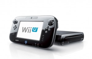
 I have been using my Wii U a lot recently. It has pushed me into finally finishing a few games that I have been meaning to beat for a while; Golden Sun, Earthbound, and Super Mario Galaxy. The Wii U also has me playing new games. I never play “new” games! I usually wait until the games are at least 20% off and even then I don’t actually play the games until 5 or 6 years later. But, one game got me back into dat new shit.
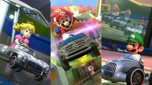
Mario Kart 8 got me to buy a full priced, sixty dollar game – my eternal resting place is experiencing a cold front, I believe. I have been having a lot of fun with MK8. Today, after getting home from work, I downloaded the Mercedes DLC pack and have been having fun with those new additions to the game – some new tires and 3 Mercedes cars. Even though I haven’t been that excited for this free content, it’s a good decision to have this kind of alliance for NIntendo. I would like to see more collaborations like this for Nintendo.
Mercedes, like Nintendo, is a company that exemplifies quality and style. Ever since the wavy design on the bottom of the Super Nintendo made me run my fingers appreciatively along it’s contours Nintendo has been making pleasing design choices. (The American design of the NES can fuck off!) With the Wii and the Wii U, Nintendo moves itself into a class with companies like Apple, Uniqlo, and Mercedes – companies with a definitive, recognizable style.
 I have been thinking of design a lot recently because of this website. I have also been thinking a lot about graphical user interface (GUI) a lot recently because of my new job working with mainframe computers. Ever day I am assaulted with at metric ton of different, ugly GUIs. My phone is an Android, my computer is a Mac that I use both as a Windows and Mac box, I have every console imaginable, and, if you think about it, each website that we navigate to is a separate GUI that we need to learn how to navigate. Most of my life is spent navigating one GUI or another and I never really compared them with one another – until now.
 It wasn’t until I downloaded the Mercedes DLC for the Wii U that I realized that the user interface that Sony and Microsoft have set up on their respective consoles for buying goods via their online store was set up by tech people and not design people. I am sure that Sony and Microsoft employ designers, but that doesn’t mean that they are any good. McDonalds makes “gourmet” hamburgers too – that doesn’t mean they are good quality burgers.
It was the design of Nintendo’s, in game DLC, interface that I found so pleasing. When I downloaded the Mercedes pack there were four descriptive screens telling me exactly what I will be downloading and then a simple download button. When I purchased the paid DLC, once again, laid out cool and clean like a car brochure, I was showed my options. This time after checking out the info I was presented with the option to buy the DLC, which was easy since I set up my card in the store already. A download bar. No fuss, no muss.
After downloading the free Mercedes DLC, I noticed that Nintendo was running a discount for pre-ordering their DLC packages. Each of these packs will contain three new drivers and two new courses. If one chooses to buy these separately, they are eight dollars a piece. But, if you are smart, you will pay $12 to pre-order them both – that is $4 that you could buy a gourmet burger with. Here were two different products that I downloaded – one free and the other paid, but they were so easy to download and they didn’t assault me with a million decisions or overly-verbose descriptions. This is a stark contrast from the way Microsoft and Sony handle their online purchasing.
In this current generation the PS4 and the Xbox One have both improved their store interfaces, both in game and out of game, but they still have a ways to go.
When Apple’s Macintosh came crashing onto the market everything about it was designed from an artistic perspective, from the Ridley Scott Super Bowl promotion to the first GUI Steve Jobs’ genius as a businessman and an artist can be seen. But, soon Windows would dominate the market, not because of their design but because of their flexibility and ease of customization.
Most iOS users would cry if they ever used Apple’s old OS 8 or 9. It wasn’t until OS X, the iPod, iTunes, the iTunes Store, and finally the iPhone that Apple started seeing financial gains from their simple yet well designed interface choices. Hopefully, Nintendo can keep plugging away at making the Wii U a cool, stylish console, while also making it an easy to use platform.
